This is what my wall used to look like with just a few of the paintings..
This painting is my complimentary painting... there are still some things that are on here that are bothering me, and I am trying to fix them without messing up the whole painting. But I like how it turned out over all... the background could be a little darker.
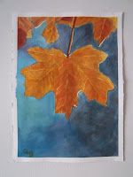
This leaf is my Intense Triad painting using the Phthalo blue, aliz crimson, and azo yellow. I think I pulled it off quite well. It took me a little less time than I thought it was going to, but I'm not complaining about that one.
This here is my wall with all my paintings up other than my final project, the apples are still drying too, but they will be up soon. Horray for paintings!!
Monday, December 13, 2010
Finally some non-procrastination:LEAVING WHITES
So here are some of the last projects that I have been working on. I have been super busy and haven't had the time to put these up. So here they are now. The first picture is a picture of my artist emulation piece. I liked how it turned out. I was pretty happy with it but I still need to put up my fixed picture of this one... ooppss
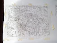
These here two below pictures are the plans I made for my painting, but that I kinda didn't stick to for the entire painting, but it helped me plan out what I wanted to do and how I wanted to go about doing it.
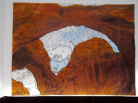
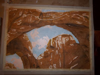
The first part of my arches picture... and the other steps follow to the end
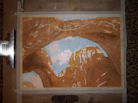
This here above is the finish part of my picture. It could probably be played with a little more, but for now I am done touching it.
I learned lots from this one: such that I always pick hard painting for myself and make them harder than they are, but I CAN finish them! I found a couple styles that I like as well with this. I may try painting by number again.
Monday, November 8, 2010
Refraction via reflection
Saturday, November 6, 2010
Glazing has been done...FINISHED
Here are the fixed pictures of the Atmospheric glazes. I fixed the clouds some by adding more light and more blue to the tops of them, also I darkened the bottom and added a little more definition to the mountainous islands in the background. I like how the sky works now, it makes me a lot happier and looks a lot better.
Here is the start of the Direct Glazing. This was kinda scary for me and I believed that the painting was ugly until I got further into the colors. YES painting this 5-7 times was a little daunting and time consuming, but I believe that it was worth it for the way that I got it to turn out. I am happy with what I was able to achieve with this method of painting, even though it took a lot of time, I believe that I will use it in the future when I continue to paint more.
Adding Azo yellow to every and all spots that showed yellow or had warm spots
Next I mixed Azo Yellow and Quin Rose to get my transparent orange and applied it to the places I felt that there were oranges.
I then mixed Quin Rose with Cad red Lt, used Alizarin Red for the cooler spots with some yellow mixed in to get the effect I was
I used Cobalt blue to mix the green on paper, and add cools to the places that I wanted them to be.
Next I mixed cobalt blue with some Azo yellow to make my green. At this point I wanted to leave it this light in the background, but I decided it would be better if the background was darker. I mixed my transparent green with a little Phthalo green and a neutral to get the dark green.
This is a picture of the painting drying but this is what it looks like. I feel I did a pretty good job and got all out of it that I wanted.
Thursday, October 28, 2010
First you glaze, then you do it some more...
This is the last little bit of touches that I did to this painting; added some more blue, more purples and blues to the snow, made the water shape bigger, and fixed under the tree line to break up the shapes a little more to help the eye travel more easy.
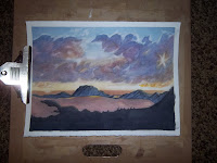
This is the start of a few glazes on top of three flat washes of Quin rose, Cobalt blue, and Azo yellow. Then I just started adding more blues, yellows, reds and purples, all mixed with the three primary colors. I tried to dabble in the skill of cloudage making, but it didn't work out too much until I added more blue behind where the clouds were, and that made it pop!
This is after some more glazes, and then I dabbled in attempting to make the clouds look like clouds. I started this piece very timidly, I didn't want to mess it up and I was scared it would not turn out the way that I wanted to. EEEK! Then I actually sucked it up and attempted the clouds which is this next picture beneath.
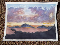
Here at this point, going through my mind, I was like, oh great the clouds suck! I don't like them, they don't even appear to look like clouds, what am I doing?! BUT I stepped away from the painting, got something to eat, stretched my legs.. then came back and attacked it with full heart, and after some removing the paint, and utilizing the magic eraser, and lifting technique... I accomplished what I was looking for. I still see some things that could be added, like making the water look more like water by adding some color variation and hue variation but that can come later. For now, this picture below, is my final product. And I like it a lot. :)
I am very proud of myself. :)
beauty! minus the lays chips underneath...hehehehe Hey, I got hungry. Great no?
Saturday, October 23, 2010
Dark painting-ness
Tuesday, October 19, 2010
To go dark or not? That is the important question of the Hour
First off, here is a picture of Sister Ellis's example of how to paint dark paintings. I know I will probably use it as a reference one day when I am in need of painting clouds at sunset/sunrise.
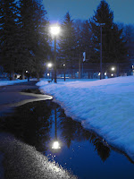
Here is my picture that I am using as a reference for my dark painting. I took this picture back last winter semester when I was in Art 117, and I just thought I could use it for more than one purpose now. Hopefully this will turn out the way that I want or would like it to go.
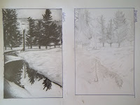
These here are my drawings from my sketch book for the values, and just the sketch of how I wanted it to look for composition; I think I am going to keep the general idea from the picture reference and use it in my painting. (I am really proud of myself and how the value drawing turned out. It made me happy, it looks really good from here. :) Hopefully I can put that into a painting.)
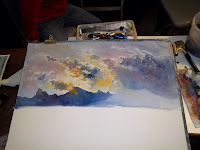
And this is what it looks like about halfway done. It took me a little while to make the neutral and with a lake of color so I wouldn't run out, but I got tired, so I went to bed and this is about what it looks like now. So here is to what the finished product may hopefully look like the original or what I perceive it will in my "artists'' mind.
Subscribe to:
Posts (Atom)